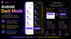

Introduction: When users open apps in bed or in a dark room, a bright white screen can hurt their eyes. Providing a Dark Mode option is no longer a luxury—it is expected. In modern Android development, Google's Material Design 3 makes adding light and dark themes extremely simple. Let's learn how to implement it automatically in your app.
The Analogy: The Chameleon App
Imagine a chameleon. During the day, it blends into green leaves. At night, it turns dark grey to stay hidden. You do not buy two different chameleons—it is the same animal, it just adapts its color skin automatically.
In Android, adding Dark Mode is exactly like that. You do not design your screens twice. Instead, you design your screens using **color variables (tokens)** like colorScheme.background or colorScheme.primary.
When the user toggles dark mode in their phone settings, Android automatically swaps the green-chameleon colors for the grey-chameleon colors, and all your screens update instantly!
How to Implement Dark Mode in Jetpack Compose
Implementing dark mode in modern apps built with Jetpack Compose takes three simple steps:
Step 1: Define Light and Dark Color Schemes
We define our light and dark color schemes in our Color.kt file using Material 3 color objects:
import androidx.compose.material3.darkColorScheme
import androidx.compose.material3.lightColorScheme
import androidx.compose.ui.graphics.Color

// 1. Light theme colors
val LightColorScheme = lightColorScheme(
    primary = Color(0xFF6200EE),
    background = Color(0xFFFFFFFF),
    onBackground = Color(0xFF000000) // Text on background
)

// 2. Dark theme colors
val DarkColorScheme = darkColorScheme(
    primary = Color(0xFFBB86FC),
    background = Color(0xFF121212),
    onBackground = Color(0xFFFFFFFF)
)
Step 2: Create a Custom Theme Composable
Next, we create a theme wrapper function that checks if the system is in dark mode (using isSystemInDarkTheme()) and loads the matching colors:
import androidx.compose.foundation.isSystemInDarkTheme
import androidx.compose.material3.MaterialTheme

@Composable
fun MyAppTheme(
    // Automatically check if phone is in dark mode
    darkTheme: Boolean = isSystemInDarkTheme(),
    content: @Composable () -> Unit
) {
    val colors = if (darkTheme) {
        DarkColorScheme
    } else {
        LightColorScheme
    }

    // Feed the colors to the MaterialTheme wrapper
    MaterialTheme(
        colorScheme = colors,
        content = content
    )
}
Step 3: Use Color Tokens in Your UI
Now, when you build screens, wrap them inside MyAppTheme and use the color variables directly. Never hardcode colors like Color.White!
@Composable
fun ProfileCard() {
    Surface(
        // Automatically becomes white in light mode, dark grey in dark mode!
        color = MaterialTheme.colorScheme.background
    ) {
        Text(
            text = "Hello, Developer!",
            // Automatically becomes black in light mode, white in dark mode!
            color = MaterialTheme.colorScheme.onBackground
        )
    }
}
XML Themes vs. Jetpack Compose Themes
Here is a comparison of how dark mode is handled in older XML projects versus modern Compose projects:
| Feature | XML Themes (Old Way) | Jetpack Compose (Modern Way) |
|---|---|---|
| Configuration Location | Multiple XML resource folders (values/values-night) | Single Kotlin file (Theme.kt) |
| State Check | System manages theme swap during recreate | Kotlin function checks isSystemInDarkTheme() dynamically |
| Dynamic Coloring | Hard to configure at runtime | Easy to swap schemes programmatically |
| Syntax Type | XML styling tags | Clean, declarative Kotlin code |
AppCompatDelegate.setDefaultNightMode(AppCompatDelegate.MODE_NIGHT_YES).Summary
Adding dark mode to your Android app is done by designing screens with color variables (tokens) rather than hardcoded colors. Material Design 3 and Jetpack Compose make this seamless by providing light and dark color schemes, checking system settings dynamically, and updating all views instantly when the user toggles dark mode. Adopt variables to support dark theme in minutes!