
Introduction: When you build an iPhone app, you want it to look beautiful. But here is the problem: some users have a small iPhone SE, some have a huge iPhone Pro Max, and others use iPads. If you put a button in a fixed spot, it will look too big, too small, or get cut off on different screens. This is where Auto Layout comes to help!
The Analogy: Elastic Strings
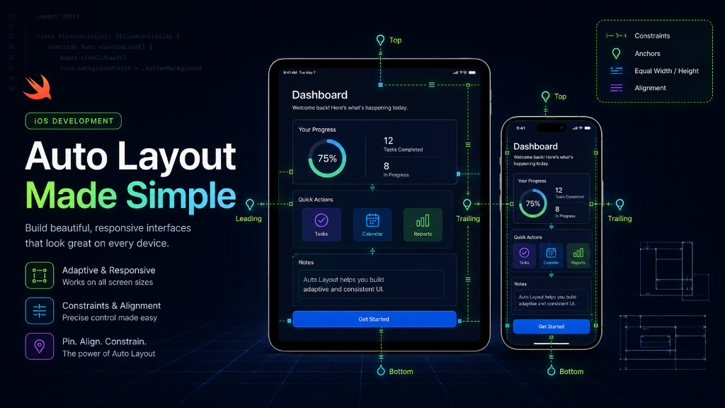
Imagine you have a bulletin board (the screen) and a paper card (a button). If you stick the card in the middle with a single pin, it can spin or fall off if the board grows. Now, imagine you tie the card to the sides of the board using elastic strings.
- If you tie a string from the left edge of the card to the left side of the board, the card will always stay a fixed distance from the left.
- If you tie strings to both the left and right sides, the card will stretch when the board gets wider!
In iOS development, these elastic strings are called Constraints. Auto Layout is just a system of constraints that tells Xcode how to stretch, shrink, and move your buttons, text, and boxes when the screen size changes.
x: 100, y: 200, width: 200, height: 50. This is called 'hardcoding' and it will break your layout on different screen sizes.The 4 Golden Rules of Constraints
For every element on your screen (like a button, an image, or a text label), iOS needs to know exactly four things. If you miss even one, Xcode will complain or your UI will look strange.
- Where is it horizontally? (X-axis): For example, how far is it from the left (leading) or right (trailing) side?
- Where is it vertically? (Y-axis): For example, how far is it from the top or bottom?
- How wide is it? (Width): Does it have a fixed size (like 150 pixels), or does it stretch to fill space?
- How tall is it? (Height): Is it a set height (like 50 pixels), or does it adjust based on the text inside?
Understanding Safe Area
Modern iPhones have a 'notch' or Dynamic Island at the top, and a swipe-up home indicator bar at the bottom. If you place a button at the very top edge of the screen, the notch will cover it.
To prevent this, Apple created the Safe Area. It is an invisible box that leaves space at the top and bottom. Always tie your top and bottom constraints to the Safe Area, not the screen edge!
Writing Auto Layout in Swift Code
While you can set constraints in Storyboards visually, professional developers often write them in code. It is cleaner and easier to manage in team projects. Here is how you write constraints for a button in Swift:
// 1. Create a simple button
let startButton = UIButton()
startButton.backgroundColor = .systemBlue
startButton.setTitle("Start Lesson", for: .normal)
view.addSubview(startButton)

// 2. IMPORTANT: Tell iOS you will set constraints yourself
startButton.translatesAutoresizingMaskIntoConstraints = false

// 3. Set the constraints (the elastic strings)
NSLayoutConstraint.activate([
    // Pin the button 20 pixels from the left side
    startButton.leadingAnchor.constraint(equalTo: view.leadingAnchor, constant: 20),

    // Pin the button 20 pixels from the right side
    startButton.trailingAnchor.constraint(equalTo: view.trailingAnchor, constant: -20),

    // Pin the top of the button to the Safe Area top
    startButton.topAnchor.constraint(equalTo: view.safeAreaLayoutGuide.topAnchor, constant: 20),

    // Give the button a fixed height of 50 pixels
    startButton.heightAnchor.constraint(equalToConstant: 50)
])
The Cheat Code: Stack Views
If you have five buttons in a row, setting constraints for each button is a lot of work. Apple created a shortcut called Stack Views (UIStackView).
Think of a Stack View as a smart organizer tray. You put your buttons inside it, and it aligns them automatically. You only need to set constraints for the Stack View itself, and it handles the items inside for you!
Common Auto Layout Errors
When using Auto Layout, Xcode might show warning logs or red lines. Here is how to understand them:
| Error Name | What it means | How to fix it |
|---|---|---|
| Missing Constraints | You forgot to set one of the 4 golden rules. | Add the missing constraint (like a width or height). |
| Conflicting Constraints | You gave opposite rules (e.g. width is 100 AND width is 200). | Delete one of the rules so there is only one clear direction. |
| Clipping Content | The box is too small for the text inside. | Do not set a fixed height/width; let the text push the edges. |
Summary
Auto Layout uses constraints to make sure your elements look perfect on all screens. Remember: every view needs constraints to set its **X position**, **Y position**, **width**, and **height**. Avoid fixed coordinates and make use of Stack Views to keep your code simple and readable!